Antonio NetoThe problem of wanting the data in an ExcelWhen we work with Dashboards, in general, after a careful construction process, one of the classic comments we have at the end is “Your…Jul 31, 20233Jul 31, 20233
InLevel Up CodingbyRaviTeja GAdvanced Seaborn: Demystifying the Complex Plots!Part 2: Enhance your data storytelling with these complex yet simple plots.Sep 29, 20234Sep 29, 20234
InTDS ArchivebyLee VaughanHow to Automatically Extract and Label Data Points on a Seaborn KDE PlotA Kernel Density Estimate plot is a method — similar to a histogram — for visualizing the distribution of data points. While a histogram…Sep 5, 2023Sep 5, 2023
InTDS ArchivebyLee VaughanBuild a Better Bar Chart with This Trick(It’s really a seaborn scatter plot!)Aug 26, 20231Aug 26, 20231
InTDS ArchivebyLee VaughanMake Beautiful (and Useful) Spaghetti Plots with PythonStacked line charts are so hot right now!Aug 16, 20234Aug 16, 20234
InTowards AIbyBex T.Advanced Tutorial: How to Master Matplotlib Like an Absolute BossUse Matplotlib like never beforeAug 29, 20235Aug 29, 20235
InData At The Core !byKamna SinhaUnderstanding Marketing Analytics in Python.We shall continue our story from previous parts of the series : part 1 : we created our sales data set for 2 products using various…Sep 13, 2023Sep 13, 2023
Rasmo WanyamaTime Series Forecasting for Predicting Store Sales: A Comprehensive Guide1. IntroductionJul 31, 20231Jul 31, 20231
InArtificial Intelligence in Plain EnglishbyManinder SinghEnhancing NLP Models with Data Augmentation TechniquesUse these Data Augmentation techniques in your NLP-based projects to increase model accuracy and reliability.Aug 31, 2023Aug 31, 2023
Maninder SinghUnderstanding Categorical Correlations with Chi-Square Test and Cramer’s VIn this, I explained about correlation(code) between categorical features which I Learned when wanted to find the same in one of my…Jun 18, 20232Jun 18, 20232
InDev GeniusbyHugo PerdomoVisual Tools for Exploratory Data Analysis with PythonA beginner’s exploration of interesting libraries for EDA.Apr 12, 2023Apr 12, 2023
Sainadh BahadurshaExploratory Data Analysis on INSTACART Dataset and Market Basket Analysis-Association rules…Jul 17, 2023Jul 17, 2023
InTowards AIbyAnn Mary ShajuUnivariate, Bivariate, and Multivariate AnalysisA beginner guide to exploratory data analysis using Matplotlib and SeabornMay 18, 20231May 18, 20231
NitinKumar SharmaEDA MindMap:Apparel Sales DataIn my role as an e-commerce analyst, I had the privilege of delving into two vital datasets: the Dress Attribute Dataset and Dress Sales…Sep 7, 2023Sep 7, 2023
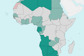
InTDS ArchivebyOscar LeoMatplotlib Tutorial: Let’s Take Your Country Maps to Another LevelHow to draw beautiful maps with Python and MatplotlibSep 24, 20235Sep 24, 20235
InTDS ArchivebyAndy McDonald4 Essential Tools to Help You Select a Colour Palette for Your Data VisualisationTools for Making it Easy to Select Colour Palettes for Data VisualisationsMar 15, 20233Mar 15, 20233
InPython in Plain EnglishbyMax NUnveiling Insights with Line Charts: Transforming Data into Stories Using Matplotlib in PythonA Beginner’s Guide to Crafting Engaging Line Charts for Data Exploration in PythonAug 14, 2023Aug 14, 2023
InLevel Up CodingbyMax NIlluminating Insights: Data Visualization with Scatterplot Charts using Matplotlib in PythonTransform Raw Data into Visual Tales with Matplotlib’s Scatterplot MagicAug 17, 2023Aug 17, 2023
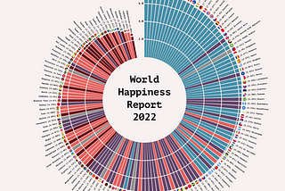
InTDS ArchivebyOscar LeoHow to Create a Polar Histogram With Python and MatplotlibCreating a graph that captures the eye and tells the beholder an insightful story.Aug 24, 20234Aug 24, 20234
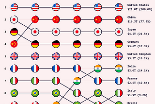
InTDS ArchivebyOscar LeoHow to Create Eye-Catching Country Rankings Using Python and MatplotlibA beautiful alternative to standard line chartsAug 18, 20238Aug 18, 20238